
In this week’s magazine we take a look at what investors can learn from the disastrous Deliveroo IPO. We also look at the luxury goods sector – which has proved surprisingly resilient throughout the pandemic and is set for “years of galloping growth”, says Stephen Connolly. He picks some of the best stocks to buy.
Merryn’s on holiday, so this week John has taken over podcast duties. He talks to investor, analyst and author Steve Clapham about many things, but in particular about why you really need to know what you’re doing when you pick individual stocks (and why even if you’re just investing in funds, learning about how to value a company is very useful). Listen to that chat here, and get a discount on Steve’s latest book The Smart Money Method, to boot.
Speaking of funds, this week’s “Too Embarrassed To Ask” video explains what an “ETF” – AKA exchange-traded fund – is. You can watch the video here.
Subscribe to MoneyWeek
Subscribe to MoneyWeek today and get your first six magazine issues absolutely FREE

Sign up to Money Morning
Don't miss the latest investment and personal finances news, market analysis, plus money-saving tips with our free twice-daily newsletter
Don't miss the latest investment and personal finances news, market analysis, plus money-saving tips with our free twice-daily newsletter
Here are the links for this week’s editions of Money Morning and other web stories you may have missed.
- Tuesday Money Morning: Inflationary pressure is building across the globe. But is it here to stay?
- Merryn’s Blog: Deliveroo’s IPO flop shows which way the market is going
- Web article: BP looks set to return more money to shareholders as it beats expectations
- Wednesday Money Morning: Tech has dominated the economy – but the real world is about to strike back
- Web article: What will Joe Biden’s “build back better” plan mean for markets?
- Thursday Money Morning: International tax competition is under threat – which stocks are most vulnerable?
- Web article: Central banks are rushing to build digital currencies. What are they, and what do they mean for you?
- Friday Money Morning: Nuclear power might never be popular – but now looks a good time to invest
- Web article: House prices: from boom to even bigger boom
Now for the charts of the week.
The charts that matter
Gold saw quite the rebound, back to its highest in six weeks or so.

(Gold: three months)
The US dollar index (DXY – a measure of the strength of the dollar against a basket of the currencies of its major trading partners) plunged back down – could Joe Biden’s big spending plan have had an effect?

(DXY: three months)
The dollar’s weakness doesn’t seem to have been reflected against the Chinese yuan (or renminbi) however – when the red line is rising, the dollar is strengthening while the yuan is weakening.

(Chinese yuan to the US dollar: since 25 Jun 2019)
The yield on the ten-year US government bond continued to drift downwards slightly.

(Ten-year US Treasury yield: three months)
The yield on the Japanese ten-year bond dropped back after the previous week’s big rise.

(Ten-year Japanese government bond yield: three months)
And the yield on the ten-year German Bund drifted along in negative territory.

(Ten-year Bund yield: three months)

Copper, too, traded in a range.
(Copper: nine months)
And the closely-related Aussie dollar continued to struggle off its three-month low, and remains depressed.

(Aussie dollar vs US dollar exchange rate: three months)
Cryptocurrency bitcoin is biding its time, presumably before it either goes on another wild charge upwards or plummets by 30% or so, giving everyone plenty to talk about.

(Bitcoin: three months)
US weekly initial jobless claims rose by 16,000 to 744,000, compared to 728,000 last week (revised up from 719,000). The four-week moving average rose to 723,750, up 2,500 from 721,250 (which was revised up from 719,000) the week before.

(US initial jobless claims, four-week moving average: since Jan 2020)
The oil price is another one that’s drifting along sideways.

(Brent crude oil: three months)
Amazon, however, was back, at the races.

(Amazon: three months)
But Tesla is also sidling along quietly.

(Tesla: three months)
Have a great weekend.
-
 Rightmove: Asking prices edge closer to record peak
Asking prices have been driven up by the top-end of the market, Rightmove has found. But how does the situation look in your area?
-
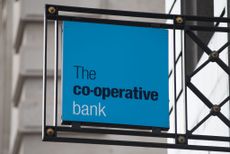 Coventry Building Society bids £780m for Co-operative Bank - what could it mean for customers?
Coventry Building Society has put in an offer of £780 million to buy Co-operative Bank. When will the potential deal happen and what could it mean for customers?


-
 UK wages grow at a record pace
The latest UK wages data will add pressure on the BoE to push interest rates even higher.
-
 Trapped in a time of zombie government
It’s not just companies that are eking out an existence, says Max King. The state is in the twilight zone too.
-
 America is in deep denial over debt
The downgrade in America’s credit rating was much criticised by the US government, says Alex Rankine. But was it a long time coming?
-
 UK economy avoids stagnation with surprise growth
Gross domestic product increased by 0.2% in the second quarter and by 0.5% in June
-
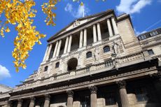 Bank of England raises interest rates to 5.25%
The Bank has hiked rates from 5% to 5.25%, marking the 14th increase in a row. We explain what it means for savers and homeowners - and whether more rate rises are on the horizon
-
 UK wage growth hits a record high
Stubborn inflation fuels wage growth, hitting a 20-year record high. But unemployment jumps
-
 UK inflation remains at 8.7% ‒ what it means for your money
Inflation was unmoved at 8.7% in the 12 months to May. What does this ‘sticky’ rate of inflation mean for your money?
-
 VICE bankruptcy: how did it happen?
Was the VICE bankruptcy inevitable? We look into how the once multibillion-dollar came crashing down.


