The charts that matter: the dollar bounces, bitcoin soars, Tesla roars
As bitcoin and Tesla go stratospheric and the US dollar rebounds, John Stepek looks at the charts that matter most to the global economy.

In our first issue of MoneyWeek magazine for the New Year, we turn to a subject that has been strangely absent from the headlines given what a big story it was for so long – Brexit, and the deal struck between Britain and the EU just before Christmas. Is it any good? Does it draw a line under the Brexit discussion? Where do we go from here? It’s all in the latest issue – get your first six mags free when you subscribe.
In this week’s podcast, Merryn and I marvelled at bitcoin, railed at Tesla, and wondered at just how much more manic things can get before a crash – surely – arrives to deliver a reality check to markets (in the US at least). We also decided that a one-off debt write-off would probably be the best way out of our economic mess, even although it comes fraught with difficulty. Have a listen here.
I also appeared on The Week podcast this week. I decided to scare everyone by talking about Bank of England money printing and hyperinflation. We also discussed Jack Ma’s mysterious disappearance – have a listen here.
Subscribe to MoneyWeek
Subscribe to MoneyWeek today and get your first six magazine issues absolutely FREE

Sign up to Money Morning
Don't miss the latest investment and personal finances news, market analysis, plus money-saving tips with our free twice-daily newsletter
Don't miss the latest investment and personal finances news, market analysis, plus money-saving tips with our free twice-daily newsletter
On the podcasts by the way – if you have the time, inclination and the option to do so, please leave us a review (preferably a five-star one) on whatever podcast platform you use. It shows us you want us to keep doing them and it shows the platform that people want to hear them.
Our latest “Too Embarrassed To Ask” video explains what investment trusts are. They’re our favourite type of fund so they’re worth understanding if you don’t already. You can watch the video here.
Here are the links for this week’s editions of Money Morning and other web stories you may have missed.
- Monday: What does the Brexit deal mean for your money?
- Tuesday: Here’s why you should pay attention to the Chinese yuan
- News story: When lockdown ends, be prepared for an inflationary surprise
- Wednesday: Frisby’s forecasts – what does 2021 have in store for investors?
- Thursday: Here’s why markets have shrugged off the US political turmoil
- Friday: How rising oil prices could prick the US stockmarket bubble
Now for the charts of the week.
The charts that matter
Gold had a bit of a spike over the week as the results of the election in Georgia revealed that the Democrats will have control of the US government. That means there should probably be more government spending than there otherwise would have been. However, on Friday (which isn’t shown on the chart below), the bottom fell out somewhat as the US dollar had a rebound. Whether that rebound can last – we’ll see.
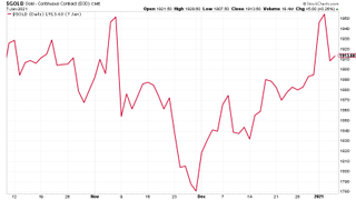
(Gold: three months)
The US dollar index (DXY – a measure of the strength of the dollar against a basket of the currencies of its major trading partners) remained weak but is starting to rebound. Given how certain everyone is that the dollar will fall this year, this is exactly the sort of “surprise” to keep an eye on. There are lots of good reasons for the dollar to fall – but there are some reasons why it might not.
The Chinese authorities won’t necessarily want to see the yuan strengthen much more against the dollar. Same goes for the European Central Bank and the euro. And then you have the fact that US Treasury yields have bounced strongly, which all else being equal, should attract capital into the US. And with the election chaos near an end (despite the scenes in the US this week) then maybe a weak dollar is less of a sure thing than everyone expects.
Let’s keep a close eye on it. I’m not convinced the rally will last but it could definitely upset the apple cart if it does.
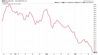
(DXY: three months)
The Chinese yuan (or renminbi) carried on rising against the US currency (when the black line below rises, it means the yuan is getting weaker vs the dollar). Will that continue this year? I discussed the topic in a Money Morning earlier this week.
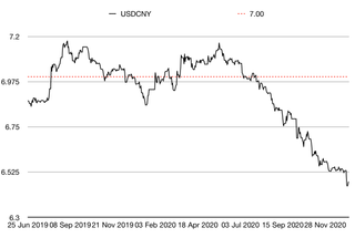
(Chinese yuan to the US dollar: since 25 Jun 2019)
The yield on the ten-year US government bond has surged higher (in relative terms) since the start of the year. This is a sign that investors are starting to believe in the “reflation” trade. However, you’re also going to get to a point before too long where the Federal Reserve gets twitchy about this increase in interest rates. What’ll happen when that particular push comes to shove? The Fed might have to print more money – or find an excuse to do so – in order to suppress rates.
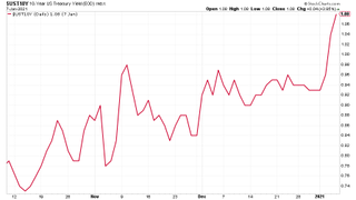
(Ten-year US Treasury yield: three months)
What’s also interesting is that the yield on the Japanese ten-year actually bumped higher in line with the US ten-year. Nothing to write home about yet, but remember that the Japanese central bank pretty much maintains this as a ‘dead’ market with the yield pinned to 0%. It’ll be interesting to see what happens if the market starts to test the bank’s resolve on that front.
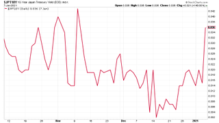
(Ten-year Japanese government bond yield: three months)
Notably, the yield on the ten-year German Bund didn’t shift as much. Optimism over reflation is far more muted in the eurozone, and that’s purely down to competition between central banks. The European Central Bank simply doesn’t have the leeway of others around the world, and that gives the eurozone a “hard” currency tendency – at least for the time being.
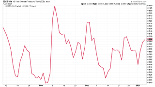
(Ten-year Bund yield: three months)
Copper is still the asset class to be in. It appears to be the ultimate reflation trade.
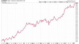
(Copper: nine months)
The Aussie dollar is still rising, though it took a breather towards the end of the week as the US dollar rebounded.
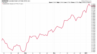
(Aussie dollar vs US dollar exchange rate: three months)
Remember back when we’d report on cryptocurrency bitcoin as recently as summer of last year, and marvel at how calm and almost entirely ignored by the market it had become? Those days are long gone. Bitcoin has almost doubled since the last Saturday Money Morning of last year (ie, less than a month). To hear Merryn and I struggle to comprehend it like the old-fashioned gold bugs we are, listen to the most recent podcast.
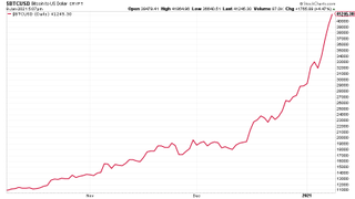
(Bitcoin: three months)
US weekly jobless claims came in at 787,000, compared to 790,000 last week. That was better than expected – analysts had been looking at 833,000. The four-week moving average rose to 818,750 from 800,000 the week before.
Meanwhile the market largely ignored the latest non-farm payrolls data, even although it was much weaker than expected (140,000 jobs were lost in December, mainly due to lockdowns hitting the restaurant sector). This is likely to continue until the pandemic is much closer to an end.
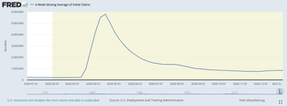
(US jobless claims, four-week moving average: since Jan 2020)
The oil price (as measured by Brent crude) rose sharply this week as Saudi Arabia made a surprise cut to production.
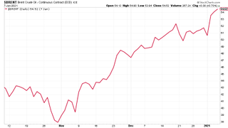
(Brent crude oil: three months)
Amazon drifted again. It’s not of much interest to investors when there are stocks like Tesla. If this stasis lasts much longer, there’s a danger of Amazon becoming a value stock...
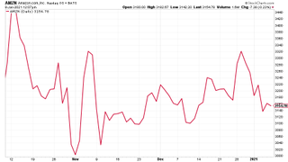
(Amazon: three months)
As always, there is very little I can say about Tesla except “wow” (and everything I said to Merryn on the podcast of course). Anyone who thought promotion to the S&P 500 would mark the top has been desperately disappointed, let’s just put it that way.
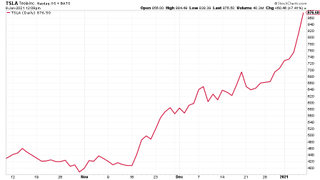
(Tesla: three months)
Have a great weekend.
John is the executive editor of MoneyWeek and writes our daily investment email, Money Morning. John graduated from Strathclyde University with a degree in psychology in 1996 and has always been fascinated by the gap between the way the market works in theory and the way it works in practice, and by how our deep-rooted instincts work against our best interests as investors.
He started out in journalism by writing articles about the specific business challenges facing family firms. In 2003, he took a job on the finance desk of Teletext, where he spent two years covering the markets and breaking financial news. John joined MoneyWeek in 2005.
His work has been published in Families in Business, Shares magazine, Spear's Magazine, The Sunday Times, and The Spectator among others. He has also appeared as an expert commentator on BBC Radio 4's Today programme, BBC Radio Scotland, Newsnight, Daily Politics and Bloomberg. His first book, on contrarian investing, The Sceptical Investor, was released in March 2019. You can follow John on Twitter at @john_stepek.
-
 Private school fees soar and VAT threat looms – what does it mean for you?
Rising private school fees could see more than one in five parents pull their children out of their current school. Before you remortgage, move house or look to grandparents for help, here’s what you need to know.
By Katie Williams Published
-
 Best and worst UK banks for online banking revealed
When it comes to keeping your money safe, not all banks are equal. We reveal the best and worst banks for online banking when it comes to protecting your money from scams
By Oojal Dhanjal Published
-
 UK wages grow at a record pace
The latest UK wages data will add pressure on the BoE to push interest rates even higher.
By Nicole García Mérida Published
-
 Trapped in a time of zombie government
It’s not just companies that are eking out an existence, says Max King. The state is in the twilight zone too.
By Max King Published
-
 America is in deep denial over debt
The downgrade in America’s credit rating was much criticised by the US government, says Alex Rankine. But was it a long time coming?
By Alex Rankine Published
-
 UK economy avoids stagnation with surprise growth
Gross domestic product increased by 0.2% in the second quarter and by 0.5% in June
By Pedro Gonçalves Published
-
 Bank of England raises interest rates to 5.25%
The Bank has hiked rates from 5% to 5.25%, marking the 14th increase in a row. We explain what it means for savers and homeowners - and whether more rate rises are on the horizon
By Ruth Emery Published
-
 UK wage growth hits a record high
Stubborn inflation fuels wage growth, hitting a 20-year record high. But unemployment jumps
By Vaishali Varu Published
-
 UK inflation remains at 8.7% ‒ what it means for your money
Inflation was unmoved at 8.7% in the 12 months to May. What does this ‘sticky’ rate of inflation mean for your money?
By John Fitzsimons Published
-
 VICE bankruptcy: how did it happen?
Was the VICE bankruptcy inevitable? We look into how the once multibillion-dollar came crashing down.
By Jane Lewis Published