
Welcome back.
First things first, keep an eye out for a very special podcast landing in your inbox on Monday morning – Merryn has interviewed one of our favourite financial market analysts, Russell Napier. I won’t give you any spoilers here – suffice to say, it’s a must-listen. Don’t enter 2021 without it! Look out for it, Monday morning, first thing.
In the current issue of MoneyWeek, we look at IPO fever – is it really such a bad thing in a decade that has seen equity markets shunned as a place to raise capital? – and our regular writers give their top tips for the year ahead. That includes me, and I can only say I hope I do better than I did last year… get your first six issues free here if you don’t already subscribe.
Subscribe to MoneyWeek
Subscribe to MoneyWeek today and get your first six magazine issues absolutely FREE

Sign up to Money Morning
Don't miss the latest investment and personal finances news, market analysis, plus money-saving tips with our free twice-daily newsletter
Don't miss the latest investment and personal finances news, market analysis, plus money-saving tips with our free twice-daily newsletter
Also in this week’s podcast, after a succession of guests and City professionals and people whose opinions you might actually want to hear, I finally join Merryn again to chat about V-shaped recoveries, investment ideas for 2021, and how all in all it’s been a very weird year in more ways than one. Merryn also interviews a pair of entrepreneurs to find out how startup companies have coped in what certainly felt like a very hostile environment. Have a listen here.
Oh and just on podcasts – if you have the time or the inclination and the option to do so, do please leave a review (preferably a five-star one) on whatever podcast platform you use. It’s not just for our egos – the more good reviews we get, the more listeners we attract, and the more resources we can invest in developing the podcast to make it even better.
Speaking of IPOs, that’s what our latest “Too Embarrassed To Ask” video is all about. So if you’re confused as to what an IPO is, or why it happens, you can dispel that confusion in a little over two minutes’ viewing by clicking here.
And just to say – this’ll be the last Saturday edition of Money Morning until 9 January. But your daily Money Morning will soldier on through 2020 for a while longer.
Anyway, here are the links for this week’s editions of Money Morning and other web stories you may have missed.
- Monday: The market is looking bubbly – here's the best defence for investors right now
- Tuesday: Is the reflation trade already priced into markets?
- Wednesday: With Brexit back in the news, which way now for the pound sterling?
- Thursday: Bitcoin has hit a new record high – and this time the professionals are piling in too
- Friday: What the current state of the Brexit talks means for investors
Now for the charts of the week.
The charts that matter
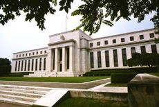
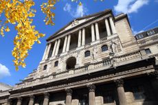
Gold made a comeback this week as the most important event of all – the Federal Reserve’s latest meeting – passed by without any sign that the Fed will even consider raising interest rates until inflation is well and truly upon us. With a signal of intent that clear, it’s almost a surprise that gold isn’t higher than it is.

(Gold: three months)
The US dollar index (DXY – a measure of the strength of the dollar against a basket of the currencies of its major trading partners) slid decisively after the Fed meeting, and it’s getting harder and harder for dollar bulls to maintain the idea that this is a passing correction.

(DXY: three months)
The Chinese yuan (or renminbi) carried on rising against the US currency (when the black line below rises, it means the yuan is getting weaker vs the dollar). At some point, the Chinese will start to feel that this is a problem – it’s not good for their manufacturers – but so far we haven’t reached that point.

(Chinese yuan to the US dollar: since 25 Jun 2019)
The yield on the ten-year US government bond was little changed, but drifting higher.

(Ten-year US Treasury yield: three months)
The yield on the Japanese ten-year stayed nailed to the floor.

(Ten-year Japanese government bond yield: three months)
The yield on the ten-year German Bund perked up imperceptibly from last week.

(Ten-year Bund yield: three months)
Copper kept rising as investors become ever more convinced of the “green bubble, reflation bonanza” scenario for next year.

(Copper: nine months)
The Aussie dollar made further gains as it benefits both from demand for commodities and from the weakening US dollar.

(Aussie dollar vs US dollar exchange rate: three months)
Cryptocurrency bitcoin had a stellar week. It finally broke decisively above the 2017 high, amid signs that it’s going mainstream.

(Bitcoin: three months)
US weekly jobless claims rose even further this week, coming in at 885,000, compared to 862,000 last week (which was revised up from 853,000). Economists had been hoping for closer to 800,000. The four-week moving average rose to 812,500 from 776,000 the week before.

(US jobless claims, four-week moving average: since Jan 2020)
The oil price (as measured by Brent crude) also surged higher this week as more investors buy into the reflation trade as mattering more than the longer-term “we don’t need oil anymore” trade.

(Brent crude oil: three months)
Amazon drifted again as the background music grows ever more hostile to Big Tech, and because it’s also not a reflation trade stock.

(Amazon: three months)
Meanwhile Tesla just kept going as its promotion to the S&P 500 looms next week. I am very curious to see what happens when it goes up into the “grown-up” index. Will that mark the top? Will the weird option-related shenanigans that have helped the stock cease to function properly? Will it be a case of “buy the news, sell the event”? We’ll soon find out, just in time for Christmas.

(Tesla: three months)
Have a great weekend. And don’t miss the Russell Napier podcast – it’ll be in your inbox bright and early on Monday!
-
 Revealed: the countries with the most generous pensions
The UK state pension is often criticised for failing to deliver a comfortable retirement. So, how does our pension system compare to other countries - which countries are most generous, and at what age can you claim a state pension?
-
 Private school fees soar and VAT threat looms – what does it mean for you?
Rising private school fees could see more than one in five parents pull their children out of their current school. Before you remortgage, move house or look to grandparents for help, here’s what you need to know.


-
 UK wages grow at a record pace
The latest UK wages data will add pressure on the BoE to push interest rates even higher.
-
 Trapped in a time of zombie government
It’s not just companies that are eking out an existence, says Max King. The state is in the twilight zone too.
-
 America is in deep denial over debt
The downgrade in America’s credit rating was much criticised by the US government, says Alex Rankine. But was it a long time coming?
-
 UK economy avoids stagnation with surprise growth
Gross domestic product increased by 0.2% in the second quarter and by 0.5% in June
-
 Bank of England raises interest rates to 5.25%
The Bank has hiked rates from 5% to 5.25%, marking the 14th increase in a row. We explain what it means for savers and homeowners - and whether more rate rises are on the horizon
-
 UK wage growth hits a record high
Stubborn inflation fuels wage growth, hitting a 20-year record high. But unemployment jumps
-
 UK inflation remains at 8.7% ‒ what it means for your money
Inflation was unmoved at 8.7% in the 12 months to May. What does this ‘sticky’ rate of inflation mean for your money?
-
 VICE bankruptcy: how did it happen?
Was the VICE bankruptcy inevitable? We look into how the once multibillion-dollar came crashing down.


