
Welcome back.
In MoneyWeek this week, we look at the UK’s plans for agriculture post-Brexit and Stephen Connolly looks at why Big Data really is the “new oil” and how to profit from the companies who are best at refining it. If you don’t already subscribe, click here to get your first six issues free.
This week’s podcast will be a breath of fresh air for anyone fed up of hearing how awful everything is, particularly in the UK. Merryn talks to economist Julian Jessop about why things might be at least a little bit better than everybody seems to believe. Listen to it here.
Subscribe to MoneyWeek
Subscribe to MoneyWeek today and get your first six magazine issues absolutely FREE

Sign up to Money Morning
Don't miss the latest investment and personal finances news, market analysis, plus money-saving tips with our free twice-daily newsletter
Don't miss the latest investment and personal finances news, market analysis, plus money-saving tips with our free twice-daily newsletter
Our latest “Too Embarrassed To Ask” video discusses the thorny topic of “inflation” and explains how it’s calculated in the UK. It also addresses one key myth about deflation. Click here to watch.
Here are the links for this week’s editions of Money Morning and other web stories you may have missed.
- Monday: Sipps versus Isas: which one suits long-term savers best?
- Merryn’s blog: Five books to put on your Christmas list
- Tuesday: Can you afford to ignore investment trusts?
- Wednesday: My favourite oil stock has almost trebled since 2016 – but I’m hanging on to it
- Thursday: The most important economic trend of the last 40 years is about to reverse
- Friday: Which assets would do best from the return of inflation?
Now for the charts of the week.
The charts that matter
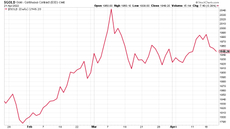
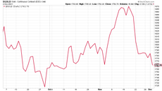
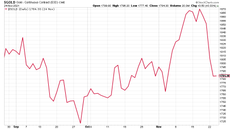
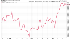
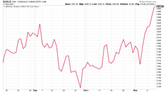
Gold’s rapid rebound stalled somewhat, which was probably mostly because the US Congress failed to pass any more relief packages. You’d expect it to happen eventually, but the lack of alacrity does cast a bit of doubt over the “overwhelming fiscal stimulus” argument. I don’t see that they have many other options but it might take more of a market reaction for US politicians to wrap their heads around that.

(Gold: three months)
The US dollar index (DXY – a measure of the strength of the dollar against a basket of the currencies of its major trading partners) was little changed, after bouncing a bit mid-week.

(DXY: three months)
The Chinese yuan (or renminbi) kept drifting higher against the US currency (when the black line below rises, it means the yuan is getting weaker vs the dollar).

(Chinese yuan to the US dollar: since 25 Jun 2019)
The yield on the ten-year US government bond ended the week unchanged on this time last week.

(Ten-year US Treasury yield: three months)
The yield on the Japanese ten-year remained the same too.

(Ten-year Japanese government bond yield: three months)
The yield on the ten-year German Bund fell further into negative territory. That’s partly down to a sense that the European Central Bank (ECB) under-delivered as usual in its latest meeting on monetary policy in the region. It’s difficult for the ECB as it’s still balancing the needs and political demands of too many nations so it is almost certainly always going to err on the conservative side (that might not be a bad thing if you’re looking for a relatively “hard” currency, but it’s certainly not the intellectual zeitgeist at the moment – not to mention that having a hard currency makes it more challenging to keep everyone on the same page politically).

(Ten-year Bund yield: three months)
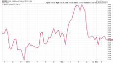
Copper just keeps going up. It’s a “green bubble” play, a “China” play, a “recovery” play – it’s got everything going for it really.

(Copper: nine months)
The Aussie dollar is really getting traction now against the US dollar, partly as its economy is recovering and also because it’s a play on all those lovely accelerating commodity prices.

(Aussie dollar vs US dollar exchange rate: three months)
Cryptocurrency bitcoin did have another go at its all-time high but then fell back sharply. It’s still hanging on, but it’ll be interesting to see if people get bored with it now that it’s not shooting higher (it’s easy to forget when it’s in one of its bull phases, but it really does sometimes go through lengthy periods of near-lifelessness).

(Bitcoin: three months)
US weekly jobless claims shot higher this week, a significantly worse result than expected. Economists had expected around 725,000 first-time jobless claims, but instead the number came in at 853,000, which was up 137,000 on last week’s figure (which was revised slightly higher to 716,000). The four-week moving average rose to 776,000 from 740,500 the week before.

(US jobless claims, four-week moving average: since Jan 2020)
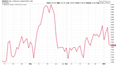
The oil price (as measured by Brent crude) managed to burst above $50 a barrel this week – good timing for Dominic Frisby to update us on his “trade of the lustrum”.

(Brent crude oil: three months)
Amazon had another pretty dull week this week as it just meanders around with the index.

(Amazon: three months)
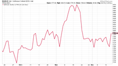
I pointed out earlier in the week that Tesla, more than any other major stock in the market, has summed up the themes of the last decade or more perfectly – nobody cares about getting paid today, and everyone is willing to believe in the most optimistic outcomes.
However, the stock took a bit of a knock mid-week as investment bank JP Morgan slapped a rather unflattering price target of $90 on the stock, arguing that it’s “not only overvalued but dramatically so” – trading on a mere 291 price/earnings (p/e) ratio for 2020, apparently. Analyst Ryan Brinkman advised clients not to increase their holdings in Tesla as it gets promoted to the S&P 500 later this month. Wouldn’t it be ironic if Tesla’s promotion to the S&P on 21 December marked the top for the stock? And maybe even the US market?

(Tesla: three months)
Have a great weekend.
-
 Barclays warns of significant rise in social media investment scams
Investment scam victims are losing an average £14k, with 61% of those falling for one over social media. Here's how to spot one and keep your money safe
-
 Over a thousand savings accounts now offer inflation-busting rates – how long will they stick around?
The rate of UK inflation slowed again in March, boosting the opportunity for savers to earn real returns on cash in the bank. But you will need to act fast to secure the best deals.


-
 The charts that matter: bond yields and US dollar continue to climb
Charts The US dollar and government bond yields around the world continued to climb. Here’s what happened to the charts that matter most to the global economy.
-
 The charts that matter: markets start the year with a crash
Charts As markets start 2022 with a big selloff, here’s what happened to the charts that matter most to the global economy.
-
 The charts that matter: Fed becomes more hawkish
Charts Gold rose meanwhile the US dollar fell after a key Fed meeting. Here’s what else happened to the charts that matter most to the global economy.
-
 The charts that matter: a tough week for bitcoin
Charts Cryptocurrency bitcoin slid by some 20% this week. Here’s what else happened to the charts that matter most to the global economy.
-
 The charts that matter: omicron rattles markets
Charts Markets were rattled by the emergence of a new strain of Covid-19. Here’s how it has affected the charts that matter most to the global economy.
-
 The charts that matter: the US dollar keeps on strengthening
Charts The US dollar saw further rises this week as gold and cryptocurrencies sold off. Here’s how that has affected the charts that matter most to the global economy.
-
 The charts that matter: gold hangs on to gains while the dollar continues higher
Charts The gold price continued to hang on to last week’s gains, even as the US dollar powered higher this week. Here’s how that has affected the charts that matter most to the global economy.
-
 The charts that matter: inflation fears give gold a much needed boost
Charts US inflation hit its highest in 30 years this week, driving gold and bitcoin to new highs. Here’s how that has affected the charts that matter most to the global economy.


